
Working with clients in every income range offers me the opportunity to see how money (or lack thereof) can affect a person’s decorating choices. Most often, I find that the same decorating mistakes are made regardless of how much money someone has to throw at a room.
So here are the TOP 5 DECORATING MISTAKES as I see them on almost a daily basis:
FURNITURE PUSHED UP AGAINST THE WALLS
Why on earth are people so insistent that ever piece of furniture be pushed up along the walls? Contrary to what you might think, this does NOT make a room look any bigger. Instead, it makes it look like you’ve just finished a game of Wii or you’re setting up for your next square dance. For goodness sake, try angling your furniture and pull it away from the walls to create intimacy and character.
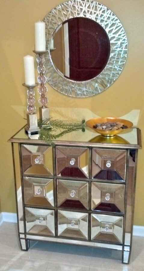
ARTWORK HUNG TOO HIGH
Unless you want to achieve an art gallery effect with large pieces of similar size, don’t fall for the misconception that art should always be placed at “eye-level”. Artwork is meant to be paired with items that create vignettes which most often means it should be lowered to “mate” with lamps, tables and sofas/chairs etc.. Consider that everyone is a different height while standing. But everyone (adults that is) sits at about the same height. When hanging artwork, make sure that it “connects” with other items in the room but also can be appreciated while seated.
SPORADIC LIGHTING
You can never have enough lighting in a room. A good rule of thumb is to have at least 6 sources of light in every room. This can include windows, lamps, recessed lighting, accent lighting, picture lights, candles etc…. A well designed space will also arrange key sources of lighting to create a triangle in the room. Dark corners come alive with the addition of a small accent lamp even on bookcases or tables. An uplight in the corner behind furniture or plants casts a warm glow and shadows add texture and layers to a room. Don’t depend on one single overhead light to do the trick. This type of lighting is never flattering and creates voids in the room. Don’t live in the dark. Even the most beautiful rooms can’t be appreciated if they aren’t well lit!
BOWLING ALLEYS
Large rooms or open floor plans can challenge even the most experienced designer. Treating these large spaces as one can end up making the room feel like a bowling alley. So, just like any other problem, I find that breaking it up into smaller components makes it more manageable. You’ll find that decorating large spaces is easier if you can create imaginary squares inside larger spaces then treat them as separate conversational or task areas. Rugs are always helpful in sectioning off spaces and give you an anchor for seating and secondary furnishings.
ACCESSORY ABUSE
Just because you own it doesn’t mean it has to be on display. Why not rotate accessories just like you do your seasonal decorations? This will give you a fresh look from time to time so that you don’t grow tired of your rooms. Make sure you leave “blank” spaces both on walls and on tables and other surfaces. Your eye needs a place to “rest” between objects so that you aren’t subconsciously annoyed by visual clutter and “noise”. And always try to group artwork in even numbers for formal looks and odd for more informal looks.
Keep these mistakes in mind as you look at your rooms. When you’re correcting these and other mistakes, try clearing out the room first and starting from scratch. That way, you won’t be tempted to just move your problems around from one place to another.

 From Decor Designs Owner & Chief Creative,