

Decorating around a favorite color is the best way to be sure you’ll love the end result. Of course, there is a fine line between done and overdone. So, it’s important to find balance! A good color story for any space will always consist of at least three colors. Using the foolproof 60-30-10 color formula to help bring balance to your color palette will keep you from making unnecessary mistakes.
What’s the 60-30-10 formula you ask? First, 60 percent of the color you see in the space should be your background or base color (usually the wall color). Next, 30 percent of the visible color palette should compliment and coordinate with the base color (usually found in window fashions, rugs, carpet or upholstery). Finally, the remaining 10 percent generally contrasts and “fights” with the base becoming a punch color in decorative accents like art, pillows and accessories!
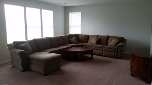
BEFORE
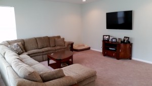
In the case of this recent family room project in Huntley’s Talamore community, we found ourselves working with walls already painted our client’s favorite color…a soft teal. Making a strong color statement with a “background” color like teal, it was important to compliment it with a coordinating color that calmed it. In this case, we added our 30% in drapery panels and an area rug with a neutral, cream background. Our punch 10% color ended up being the trendy teal partner… chartreuse green. As you can see from the After photo, the green is represented sparingly in the rug, throw pillows, window panels and accessories.
BEFORE

AFTER
Starting from scratch when picking colors can be a daunting task for many homeowners. Using the 60-30-10 formula to create a space that you love grounded in your favorite color guarantees success!
Happy Decorating from Decor Designs!

 From Decor Designs Owner & Chief Creative,