
Color trends are ever changing. What is popular one day may very well be dated and tired the next. Well…not quite that fast usually…thank goodness!
Haven’t you ever wondered why certain color combinations remind you of a period in time just as much as a particular song or piece of clothing? If I mention “harvest gold”, what decade comes to mind? Or how about teal paired with mauve? Forest green & burgundy? Or more recently, chocolate accented with pale blue? Color, in fashion and design, is one of the key elements that touches almost every business in some shape or form.
So what’s on trend for 2015? You need only pick up any home decor magazine or catalog to notice a strong trend in the last year or two toward gray. Gray is dominating as the new neutral and is being paired in fresh, fun ways with lots of hues. From robin’s egg blue, to chartreuse green, to coral, gray is a flexible neutral that balances and calms. More specifically, warmer grays (ones with a hint of brown) are trending because of their versatility with so many accent colors. Paired with another neutral like cream/off-white, the sky is the limit with an unlimited number of possible combinations.
When picking a color palette for your room, always follow the 60-30-10 formula used by designers for guaranteed results. 60% of the color in the space is your primary or “canvas” color (usually walls and/or floors/ceilings). 30% is your complimentary color that contrasts with but also enhances the primary color. Finally, every space should have at least 10% of that punch color that seems to jump out and demand attention yet plays nicely with the first two. Don’t be afraid to build on this formula using different tints/shades or tones of the same color to create a more dynamic, layered effect. In other words, for example, not every blue in the room needs to match exactly. But they do at least need to be similar.
Here are just a few of my favorites, many have snuck their way into projects I’ve done recently. From city to suburbs, these colors are fresh, yet sophisticated… young yet timeless. Which are your favorites?
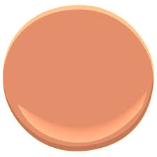
BM075 Flamingo Orange

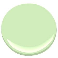
SW6414 Rice Paddy
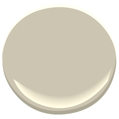
BM976 Coastal Fog

SW7044 Amazing Gray
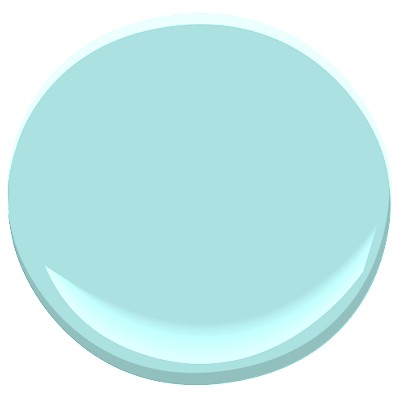
BM730 San Clemente Teal

SW7008 Alabaster

SW6332 Coral Island
BM555 Oreilly Green

SW6464 Aloe

SW7043 Worldly Gray
Don’t let a fear of color or how to use it keep you living in a world of “builder” white! Paint is one of the easiest and least expensive ways to completely change the look and feel of any room in your home. Have fun! Show some personality! Let your unique sense of style shine through! And, if you need a little help pulling the trigger, we’re just around the corner.
Happy Decorating from Decor Designs. 815-245-2433

 From Decor Designs Owner & Chief Creative,